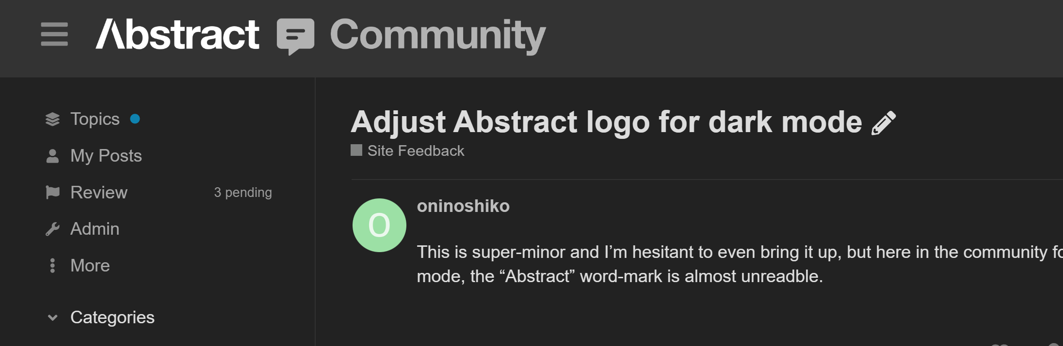
This is super-minor and I’m hesitant to even bring it up, but here in the community forum when in dark mode, the “Abstract” word-mark is almost unreadble.
Thanks for the feedback! Can you share a screenshot how it looks on your end?

This is how it looks for me! It should automatically use the right theme based on your OS settings.
Where/how did you change the theme?
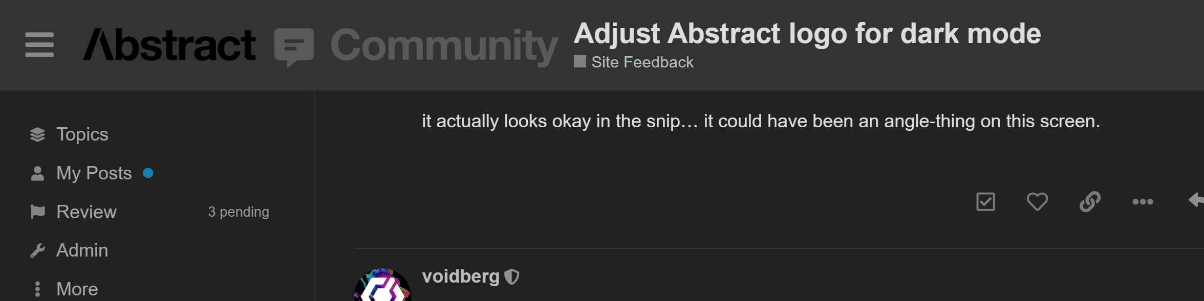
Hold up, now that I refreshed the page, it looks different!
I do believe something is wrong here, I’ll flag it for inspection.
1 Like
Hello @oninoshiko
I am happy to confirm that the site was updated and the issue with dark themes should now be resolved. Let me know if it works for you!
1 Like
Much easier to read. Thank you!
1 Like